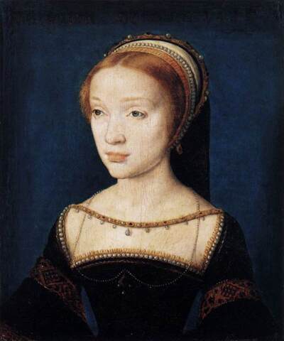
Juxtaposing the covers for my newest novel, Prize for the Fire, with the paperback cover of Fire in Beulah (images in sidebar), I think of the symbolism of fire, not only in the titles but in what these two books are about. I think, too, about how a cover image can become the book's characters in the reader's mind. While I'm writing, I hold a clear image of what a character looks like, and I try to evoke that image in words. But the picture on the cover can change everything—how the reader sees the character, and, ultimately, how I do. The young woman on the paperback cover of Fire in Beulah has become Graceful for me, though the character in my mind looked quite different when I was writing the book. Now, though, I can't see Graceful any other way.
I initially had a different image in mind for the cover of Prize for the Fire. I worked on the novel for 20 years, holding the image of young Anne Askew in my mind. After the book was finished, I looked for a portrait of a 16th century girl that matched the Anne in my mind, and the young woman in the dark portrait here matched perfectly. For technical reasons the designer couldn't use this image, though, so he found one very similar--close, but younger and saucier, less sad. I love the layout and design of the cover and am interested to see if this younger, saucier Anne replaces the girl in my mind. I expect after I've lived with her a while and carried her to bookstores and book clubs for readings, she will.
For my first book, a collection of stories, Strange Business, the first dustjacket design Viking showed me was a stock image of an empty, flat, dusty crossroads in a western ghost town—a New Yorker's vision of dusty Oklahoma. It looked nothing like the small town in eastern Oklahoma where the stories are set. I was dismayed, but being a first-time author, I didn't know if I had the authority to say anything. My editor at Viking, Will Gillham, saw my dismay. What's wrong? he said. I told him. Well, he said, find us an image that looks like what you want, and we'll use it. I was in New York then, couldn't get back to Oklahoma to take pictures, so I asked a photographer friend in Tulsa, Dawna Wallis, to please take some pictures of small towns in eastern Oklahoma. She traveled all over for a day, taking pics, and a signature redbrick building in downtown Henryetta, Oklahoma, is the one we chose for the cover. To me, it's perfect
With most of my books I've been consulted on the cover art for the hardcover, but not always for the paperback, which can result in disappointment. I loved the design and photograph for the hardcover of my first novel, The Mercy Seat (sidebar). The image doesn't correlate with the main character, Mattie, but with the younger sister she raises after their mother dies. The paperback cover, however, has a stock image of westward migration that leans too close to stereotype for my taste. The flat plains behind the wagon are nothing like the craggy mountains and green rolling valleys of Indian Territory (now eastern Oklahoma) in the novel. The paperback cover for The Mercy Seat has never become the image of the Lodi family for me.
The difference between hardcover and paperback covers can be striking. Finding the right image for my novel Kind of Kin proved trickier than expected. I came to admire the vividness of the design Ecco came up with for the hardcover (scroll down in sidebar), and it speaks well to the subject of the book—stereotyping and political demagoguery concerning immigration. But the image itself is troubling, and the book is also about community and family and a lost child, so we elected to change the cover for the paperback. The image of the little boy walking away through the tall grasses has a keener, softer appeal, and this also became the cover for the UK edition.
The cover image closest to the picture I held in my mind while I was writing is the cover for Harpsong (bottom cover in sidebar) because the book began with this image. It's a Walker Evans photograph from the 1930s, which I had tacked as a postcard to the bulletin board in my writing room in the Catskills. One day I was walking on our country road when this image and a voice came to me: "That's me and him standing at the side of the road outside Joplin, Missouri. To look at it, you wouldn't know where it was, would you? Dirt road, bare trees, it could be anywhere, Arkansas, Mississippi, these Oklahoma hills even, where we came from." This became Sharon's voice in the novel, and these are the first words I wrote for the book. It's is a love story, finally, featuring a mouth harp-playing troubadour inspired by Woody Guthrie. OU Press worked closely with me on the cover and interior design, which they used for hardcover and paperback both. It's my favorite cover of all my books, and my favorite interior design as well. Both evoke perfectly the unfolding story in the novel, and a writer can hardly ask for more than that